UI Customization
This page showcases many examples on how you can customize the user interface to your liking. As there are many examples that you likely won't use, I recommend quickly skimming through this page to see if there is anything you would like your note to do.
Note
- If you want to change something for a card-per-card basis, see the Field Reference page.
- These customizations make heavy use of runtime options and custom CSS.
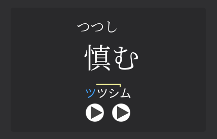
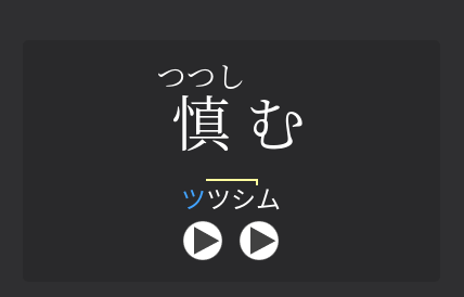
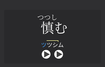
Fix Ruby Positioning (for legacy Anki versions)
New in version 0.11.0.0 (latest version: 0.11.0.4)
If the furigana appears higher than normal on your card, the following runtime option serves as a quick fix to lower the furigana:
See the pictures below to compare between furigana positions.
Why this happens
There are a few reasons why this can happen:
- Your Anki version is 2.1.49 or below.
- Your Anki version is 2.1.50 and above, but using the older Qt5 version.
- You are using AnkiMobile.
If you have this issue with the desktop version of Anki, it is recommended that you update a version with Qt6 support. This will allow the furigana to behave as expected.
If you are unable to do that for any reason, or you are using AnkiMobile, this option serves as a quick but imperfect fix to make the furigana lower. This fix is imperfect because it adds even more spacing to the left and right than normal if the furigana text is too long.
External Links
External links in primary definition
New in version 0.11.0.0 (latest version: 0.11.0.4)
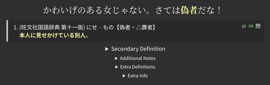
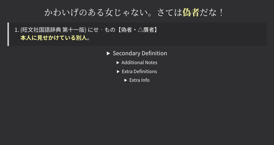
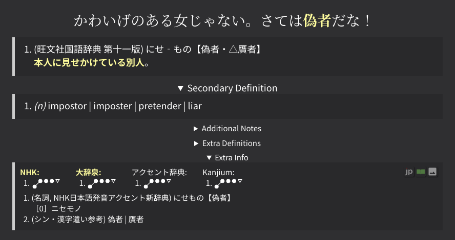
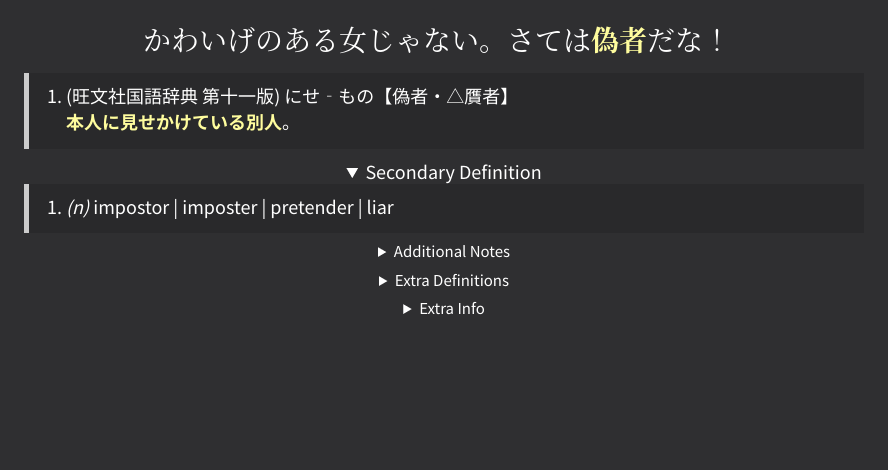
External links usually appear in the "Extra Info" section.
If you wish to have the external links to be on the primary definition section,
set external-links-position to "Primary Definition"
in the compile-time options.
Customize external links
New in version 0.10.3.0 (latest version: 0.11.0.4)
Custom external links can be specified under the external-links section
in the compile-time options.
Creating external links is self explanatory and is explained further in the config file. Additionally, some commented-out examples are provided within the file.
Remove all external links (click here)
If you want to remove all external links, set external-links to {}
in the compile-time options.
For example:
Icons with multiple text characters (click here)
When using text instead of a picture, it is recommended that you use single characters (e.g. one kanji) to represent the icon.
However, in the cases where you want to use more characters, the default CSS rules causes the icon will use the minimum amount of space, which may mis-aligned the surrounding icons.
Using the custom SCSS, you can specify the amount of space it takes (in terms of number of icons):
@use "../base/common" as common;

.glossary__external-links a[data-details="DICTIONARY_ID"] { // (1)!
  width: common.maxWidthForXIcons(2);
}
- The DICTIONARY_ID are the key values of
external-links. For example, the id of thejpdb.ioentry below is exactlyjpdb.io.
Warning
This SCSS code is NOT CSS. This cannot be added directly to the template's style sheet in Anki. Please see the link above to see how to use custom SCSS.
An example of this can be found in src/scss/dictionaries/style.scss
Adjusting Zoom
You can increase (or decrease) the size of the card, (without affecting any of Anki's GUI) with custom CSS.
Instructions (click here)
-
Under
extra/style.scss, add the following code:
Limiting number of frequencies
This CSS allows you to limit the number of frequencies shown at the top right corner.
Instructions (click here)
-
Under
extra/style.scss, add the following code: -
(Optional) Under
This will grey out the frequencies past the 5th frequency in the editor.extra/field.scss, add the following code:
TODO: ONLY VERSION 0.11.1.0 and over, NOT RELEASED YET
By default, a maximum of 4 frequencies are shown. Any more frequency list entries will appear in a dropdown arrow to the right of the frequencies.
You can edit the following runtime option to adjust this number:
Changing the display language
Warning
New as of version 0.11.1.0. This version is currently bleeding edge, so this feature cannot be used unless you compile the templates from the dev branch.
By default, the display language is in English. Currently, Japanese and English are supported as display languages.
To change the display language (say, to Japanese), use the following compile-time option:
Note
Currently, only some text is supported. This means that various tooltips on hover, warning messages, etc. will still be in English.
SentenceReading Furigana Options
By default, the furigana for the full sentence (on the back side of the card) is shown on hover. The following options change how the furigana is displayed.
SentenceReading: When to show furigana
Warning
New as of version 0.11.1.0. This version is currently bleeding edge, so this feature cannot be used unless you compile the templates from the dev branch.
By default, furigana is shown on hover. This can be changed to only be shown on click, or always/never shown.
TODO gif: show on click
Instructions (click here)
Change the following compile-time option:
This is commonly paired with the hide furigana spacing option, so furigana does not impede with the sentence whatsoever until toggled.
TODO gif: show on hover
This is the default behavior.
Instructions (click here)
Change the following compile-time option:
TODO gif: static with mouseover
This is not recommended, because you should not be relying on furigana to understand Japanese.
Instructions (click here)
Change the following compile-time option:
TODO gif: static with mouseover
If you are looking to not see furigana at all, feel free to use this option. However, I personally recommend toggling on click instead of removing furigana completely.
Instructions (click here)
Change the following compile-time option:
SentenceReading: Hide spacing
Warning
New as of version 0.11.1.0. This version is currently bleeding edge, so this feature cannot be used unless you compile the templates from the dev branch.
Furigana that extends past the length of the kanji will add additional spacing around the kanjis, which may be unpleasant to look at.
One solution to this is to simply hide the spacing until hover or click. This has the unintentional consequence where kanjis can potentionally change position, or overflow into the next line. There is also a possibility that the entire sentence shifts over a bit to the left due to (what I think is a) chromium based bug1.
TODO img
Instructions (click here)
Change the following compile-time options:
TODO img
Instructions (click here)
Change the following compile-time options:
TODO img
This is the default behavior.
Instructions (click here)
Change the following compile-time option:
Note
All of the examples above are shown with furigana on hover. They will also work with furigana on click.
Collapsed Fields
Automatically open collapsed fields
Collapsed fields are collapsed by default. These fields can be set to be automatically opened under the following runtime option:
Example Config (click here)
Do not hide empty collapsed fields
Collapsable fields that are empty are usually not shown at all. This runtime option allows them to be shown (but greyed out) when empty.
Highlight the word within the tooltips
New in version 0.11.0.0 (latest version: 0.11.0.4)
Within the tooltips, the word is not highlighted by default. This CSS allows the words to be highlighted within the sentence.

Instructions (click here)
-
Under
extra/style.scss, add the following code:
Remove the "(N/A)" on cards with no pitch accents
New in version 0.11.0.0 (latest version: 0.11.0.4)
If the word has no pitch accent, the pitch accent is usually displayed as (N/A).
This indicator can be removed with the following CSS:
Instructions (click here)
-
Under
extra/style.scss, add the following code:
Keeping and removing newlines within the display sentence
Warning
New as of version 0.11.1.0. This version is currently bleeding edge, so this feature cannot be used unless you compile the templates from the dev branch.
You can add newlines to the Sentence field to make the full sentence
field have cleaner line breaks.
If you do this, you will need to regenerate the SentenceReading
field if you are using furigana.
However, these newlines are automatically removed from the display sentence if the width of the screen is determined to be too small. To override this option, you can use the following custom CSS:
Instructions (click here)
-
Under
extra/style.scss, add the following code:
-
Under
extra/style.scss, add the following code:
This only removes newlines when the AltDisplay (or AltDisplayPASentenceCard)
field is not being used as the display sentence.
-
Under
extra/style.scss, add the following code:
Removing the furigana on the word reading
The following CSS removes the furigana on the word reading, while keeping the furigana on the kanjis within hover.
TODO image
Instructions (click here)
-
Under
extra/style.scss, add the following code:
Changing colors
Most color changes can be done by simply editing a CSS variable. These variables are shown at the very top of the main CSS sheet. For example, the following changes the main accent color of the card:
Instructions (click here)
-
Under
extra/style.scss, add the following code:
Note
To change any variable color for dark mode, you cannot use :root, even if you are only setting
the color for night mode. You must use .night_mode.
For example, doing the following will NOT change the accent for night mode:
:root {
  /* only changes light mode accent, and will NOT change dark mode accent! */
  --accent: #ff7777;
}
You must do this instead:
Removing the word / sentence at the top of the back side
Warning
New as of version 0.11.1.0. This version is currently bleeding edge, so this feature cannot be used unless you compile the templates from the dev branch.
For users who are only using one card type (e.g. only vocab cards with no sentence cards, TSCs, or anything else), it might be better to remove the tested content and the line below it.
TODO image
The tested content is shown at the back by default to allow the user to differentiate between card types on both sides of the card. However, this take up extra vertical space which is unnecessary if you are only using one card type.
Conclusion
Outside of the user interface, the note has plenty of fields you can use to further modify the card. Head over to the Field Reference page to see just that.
-
See #4 in the minor visual bugs list. ↩