Blockquotes (TODO)
For the purposes of this note type, a blockquote is simply a name given to group together the following sections of text:
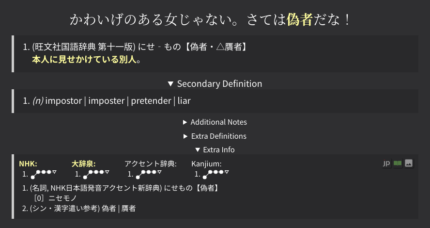
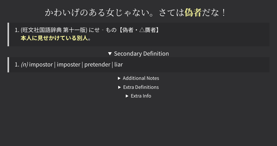
- Primary Definition
- Secondary Definition
- Additional Notes
- Extra Definitions
- Extra Info
These are called "blockquotes" because they are stylized as a blockquote,
and are internally contained inside a blockquote HTML tag.
Topics such as how dictionaries are selected are not covered here. For those topics, see the Definitions page instead.
Desktop Interface
TODO image
On desktop, only the Primary definition is revealed by default. All other blockquotes are shown by un-collapsing the individual sections.
Automatically reveal collapsed blockquotes
Collapsed sections can be set to be automatically opened under the following runtime option:
Example Config (click here)
"blockquotes.open.enabled": true,
"blockquotes.open.secondaryDefinition": true,

"blockquotes.openOnNew.enabled": true, // (1)!
"blockquotes.openOnNew.extraInfo": true,
- This allows a blockquote to be open on new cards only.
The
blockquotes.open.enabledoption always opens a blockquote. regardless of whether the card is new or not.

Grey out empty collapsed blockquotes
Collapsable fields that are empty are completely hidden by default. These can be greyed out instead, using the following runtime option:


Grey out collapsed blockquotes until hover
Even when collapsed blockquotes are hidden, it may take up more eye space than desired. One solution to this is to grey out the collapsed blockquotes until hover, with the following CSS:
/* greys out the summary text until hover */
.glossary-details > summary {
  color: var(--text-color--3);
}

.glossary-details:hover > summary {
  color: var(--text-color--1);
}

/* non-grey when open */
.glossary-details[open] > summary {
  color: var(--text-color);
}
TODO
TODO
Note
This is NOT recommended if you set blockquotes.hideEmpty to false,
because it makes differentiating between empty blockquotes and non-empty blockquotes
much more difficult.
Mobile Interface
On mobile, the collapsible sections are replaced with tabs. Clicking on these tabs reveal the relevant section.
TODO table of icon to section
Folder Tab Mode
As folder tabs are inheriently a bit different than collapsible sections, a few different modes exist to control how they behave:
Only one unique tab can show up at once. This is the default behavior.
TODO image
Anywhere from 0 to all tabs can be shown at once. This best mimics the behavior on PC.
TODO image
Show multiple tabs at once
By default, multiple tabs cannot be shown at the same time.
If you have any blockquotes.open.* runtime options set,
then you may see a warning saying:
In order to see multiple blockquotes at the same time,
you will need to set the folder tab mode to either multiple or linked.
Warning
None of the blockquotes.openOnNew options will work on mobile:
- Unfortunately, there is currently no way to determine whether a card is new on mobile or not, as it requires an Anki-Connect call not supported by AnkiConnectAndroid.
- Additionally, the AnkiDroid JS API
ankiGetCardType()doesn't seem to behave correctly either.
Likewise, there is no way to change the folder tab mode or linked tabs depending on whether the card is new,
Do not hide tabs when empty
On mobile, the tabs will be hidden when empty. This runtime option allows them to be shown (but replaced with a small dot) when empty.
TODO
TODO