Skip to content

Info Circle (TODO)

hello world

Interface

info circle example
On hover, the info circle on the top left corner just shows some basic info, However, it also serves as a notification system to the user, when it has a color.

(TODO IMAGE)
By default, the info circle shows the tags at the back side of the card only. These tags can be clicked on (to search for the tag).

info circle error example
This should only appear when some javascript code fails. In other words, this should not appear under normal circumstances. If you get this without modifying the note in any way, please see this section for basic troubleshooting.

info circle error example
This serves to warn the user about something. It can appear without completely breaking the functionality of the card. In other words, you can choose to ignore it.

info circle error example
When the card is a leech, the circle is highlighted yellow (or blue in light mode) to indicate that it is a leech. This is only shown on the back side of the card.


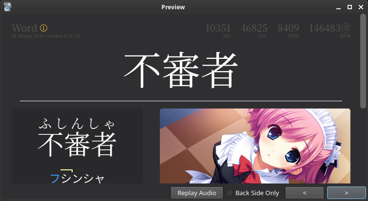
Locking the Info Circle

New in version 0.10.3.0 (latest version: 0.12.0.0-prerelease-11)

You can toggle (click on) the info circle to lock the tooltip in place. This may be useful for copying/pasting errors and other debugging purposes.


Buttons

  • Image Blur Toggle Button
    • toggles global status of image blur for the session (link)
  • Refresh Button
    • refreshes kanji hover and word indicators (link)

Last update: March 20, 2023